Double Bagel
Global platform for friendly, automated tennis tournaments
2024
Design Vision and Brand Identity
User Research
UX/UI
Desktop and Mobile Design Library
Context
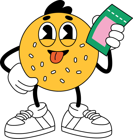
Double Bagel is a global app for casual, on-demand tennis tournaments – removing barriers like scheduling and location. It lets players of all skill levels compete anytime, anywhere, with a playful, social experience at its core. Think “Tinder for tennis”. I led product design from day one, collaborating closely with founders and developers – from concept sketches through post-launch iteration. I focused on simplicity and clarity, while solving very real usability gaps in the tennis app market.
Most tennis apps were clunky, overly competitive, and visually outdated. Players wanted something modern, casual, and engaging. The goal: build a product that felt light, social, and motivating. That became the core of my design challenge.
Challenge
The Process
Discovery & Strategy
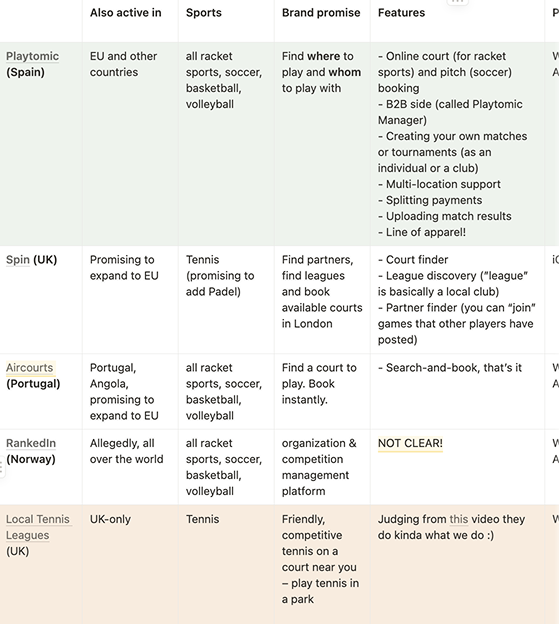
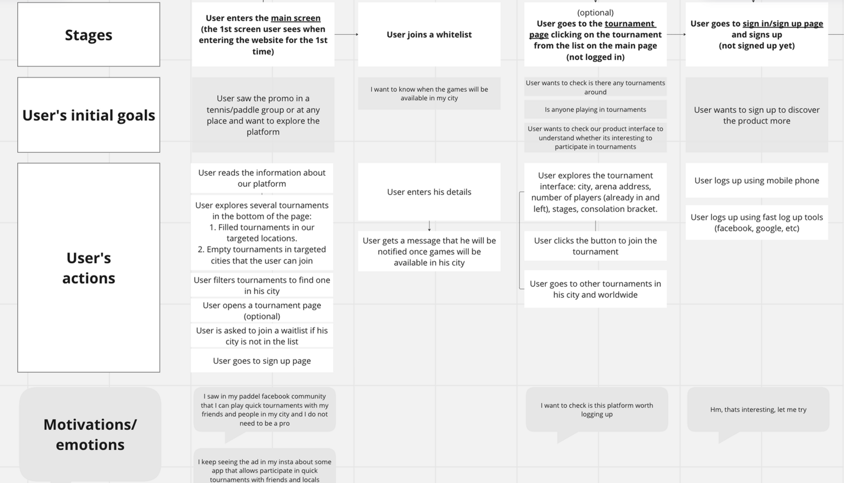
I kicked off by digging deep into the problem space: user interviews, app reviews, and competitor audits revealed that existing tools were overly serious and hard to navigate. Casual players wanted something playful, motivating, and simple to use.
Drawing inspiration from gamified apps like Duolingo, I proposed a vision for a product that was playful, intuitive, and habit-forming. My deliverables at this stage included:
- Competitive audit
- User personas & journey maps
- Vision & MVP alignment
- Interactive prototype
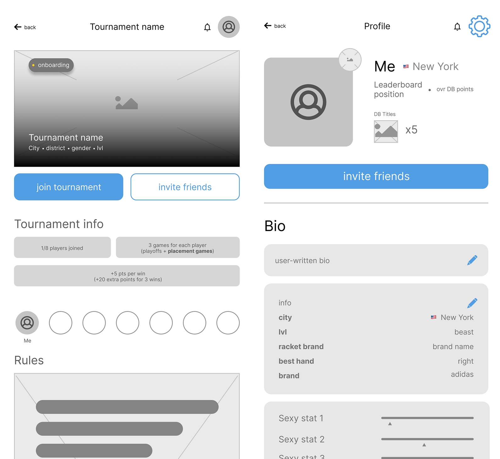
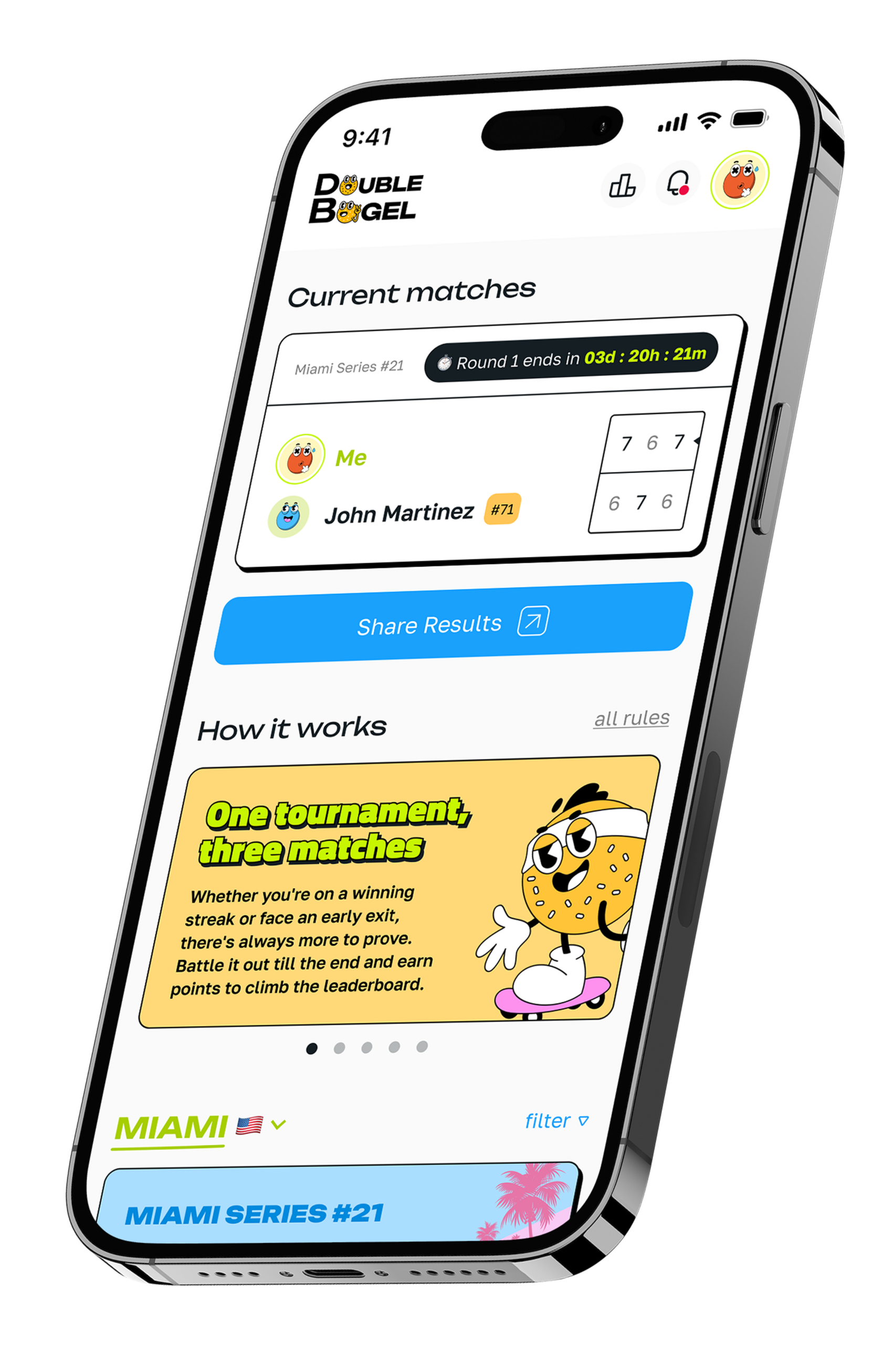
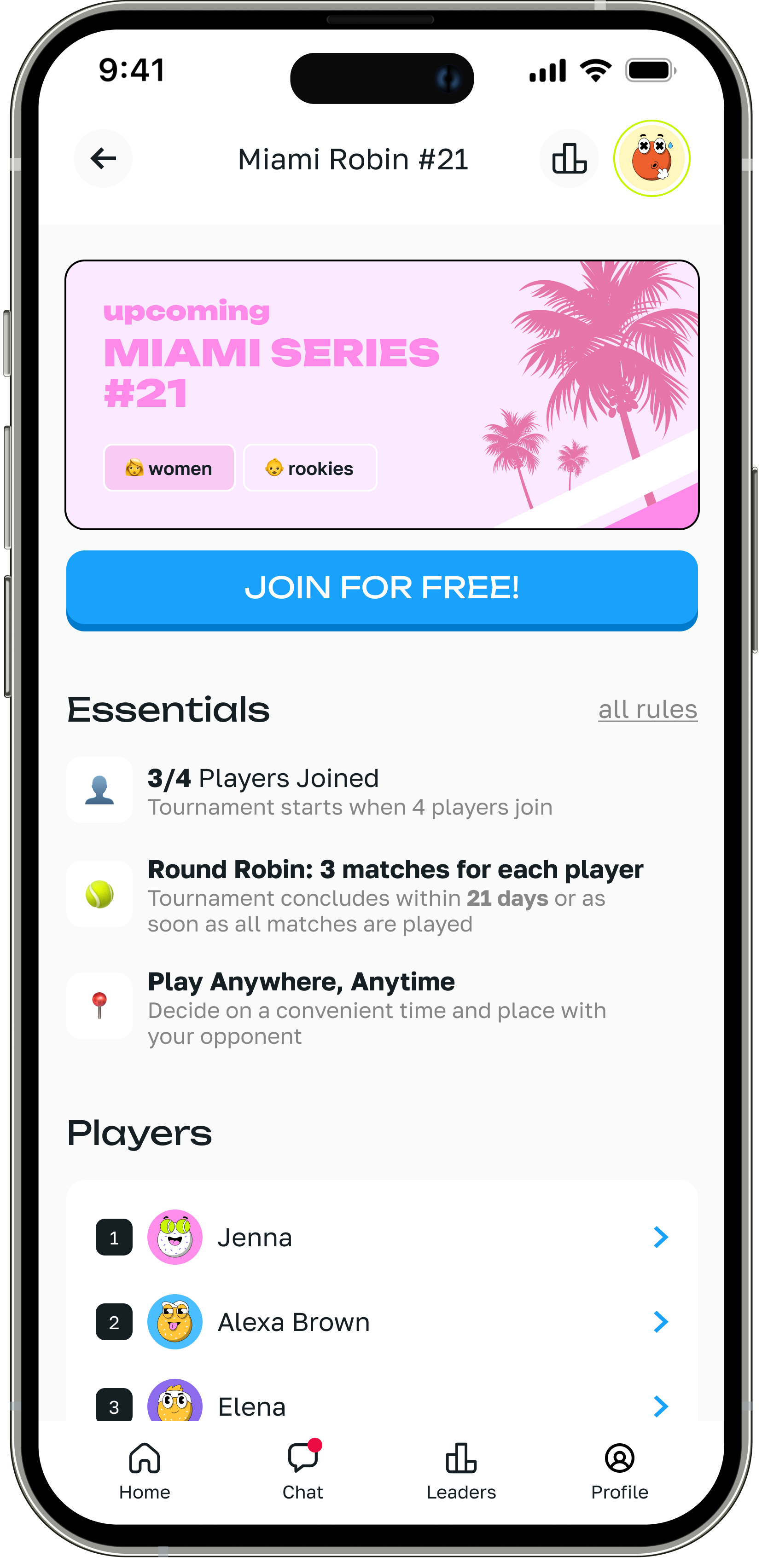
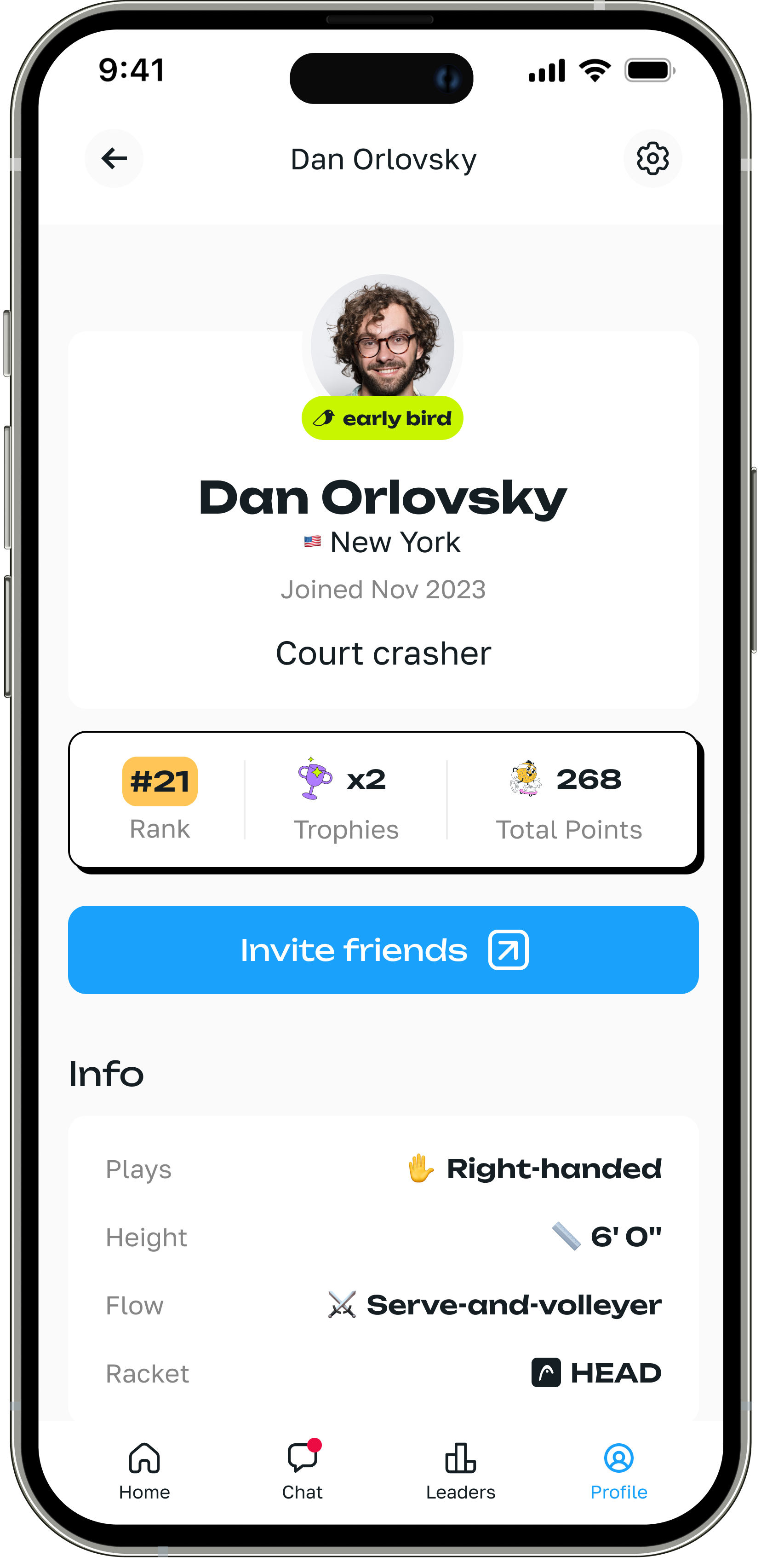
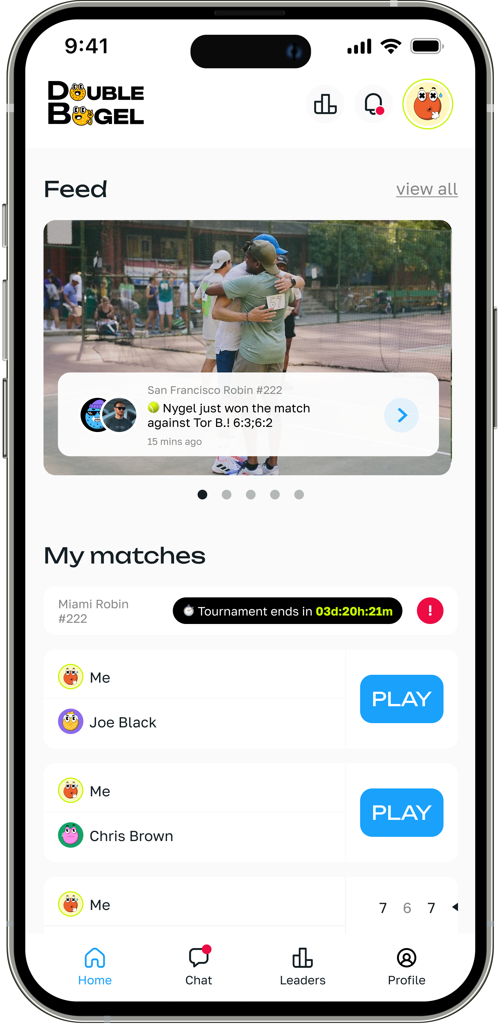
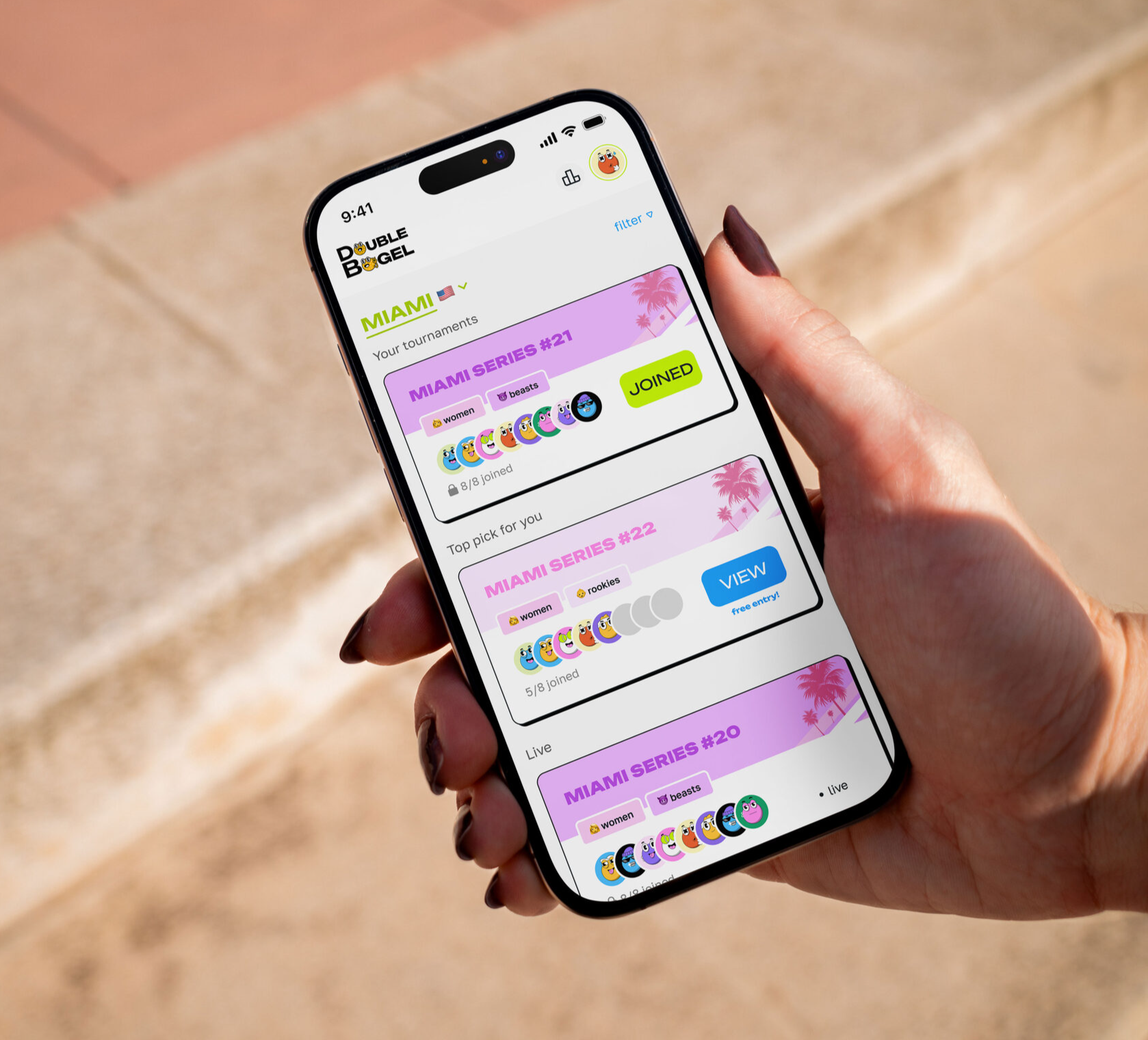
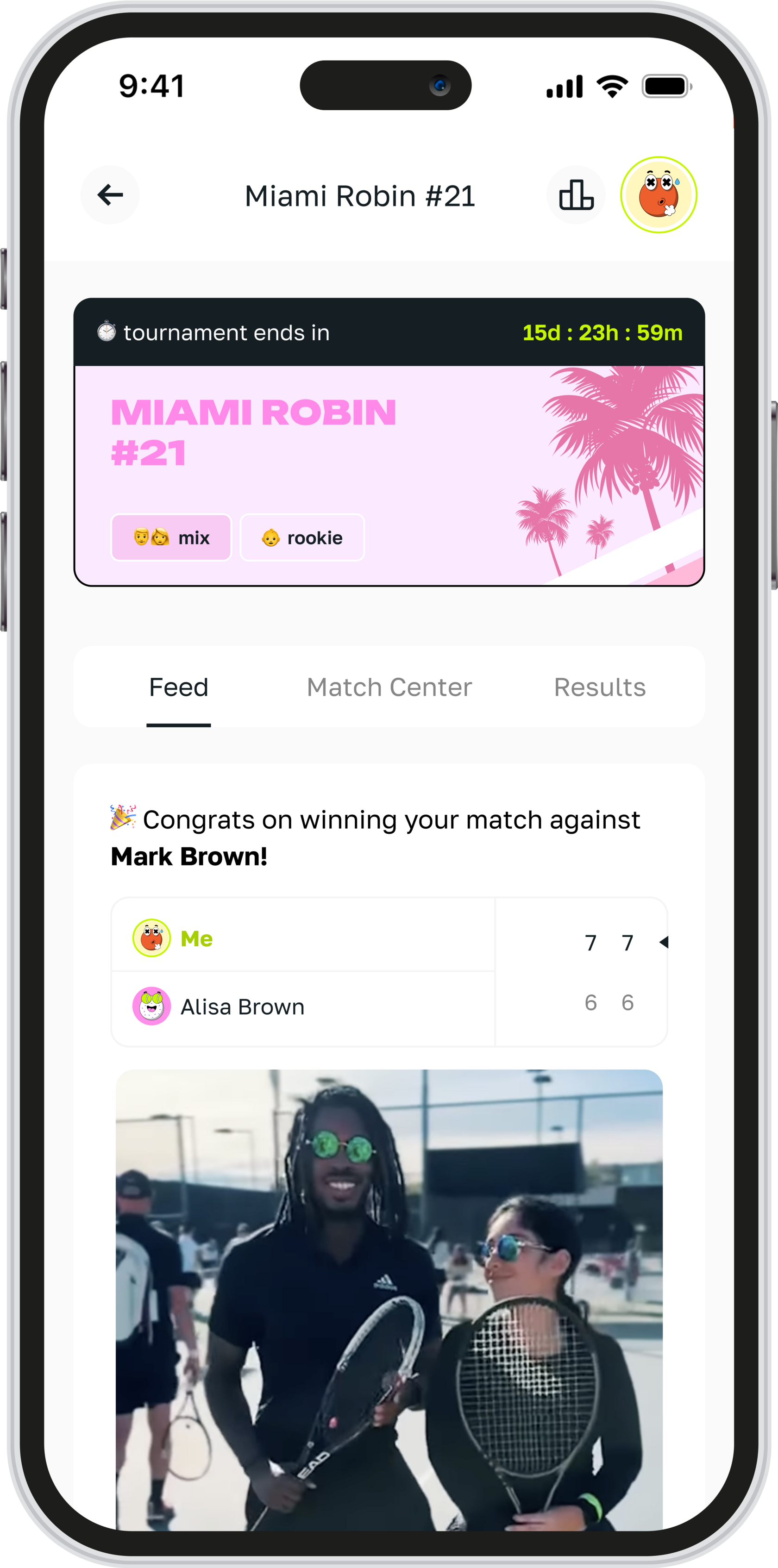
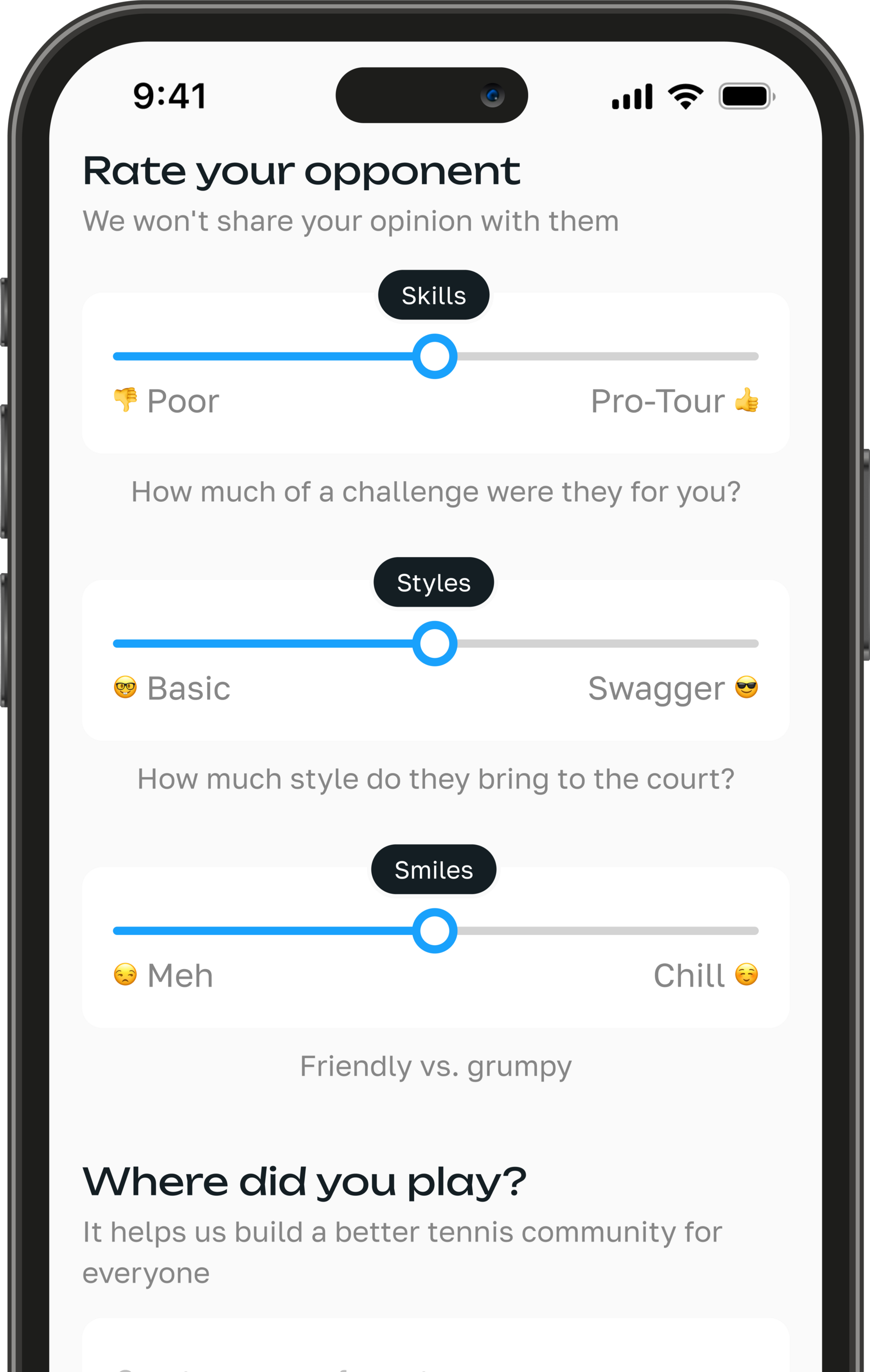
Designed 70+ screens across full user journeys, working closely with developers throughout to enable rapid iteration, frequent feedback, and high-quality execution.
Design priorities included:
• Instant access: from app open to match joined in under a minute
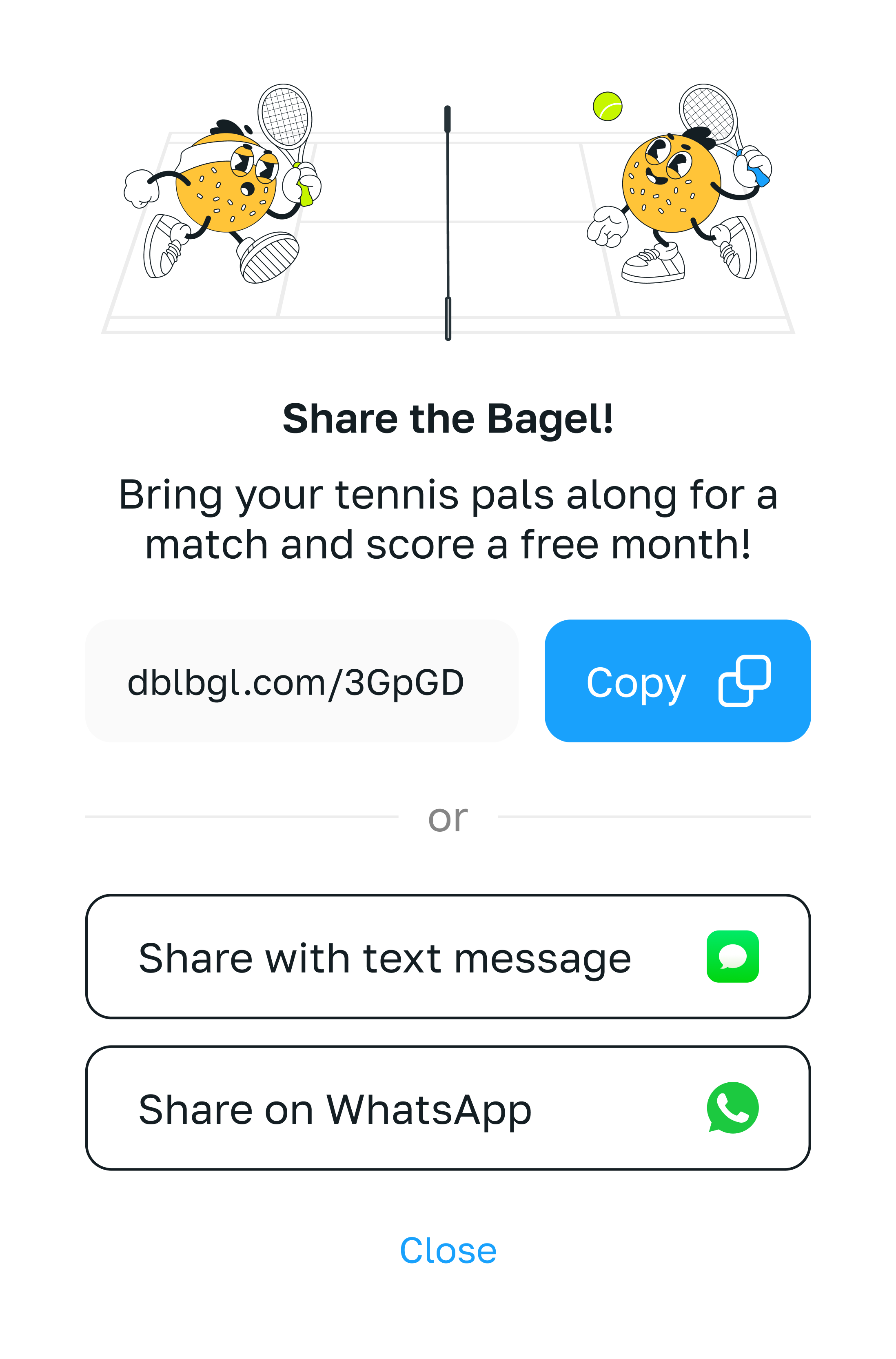
• Human touches: encouraging language, celebratory micro-interactions, and ways to build casual community
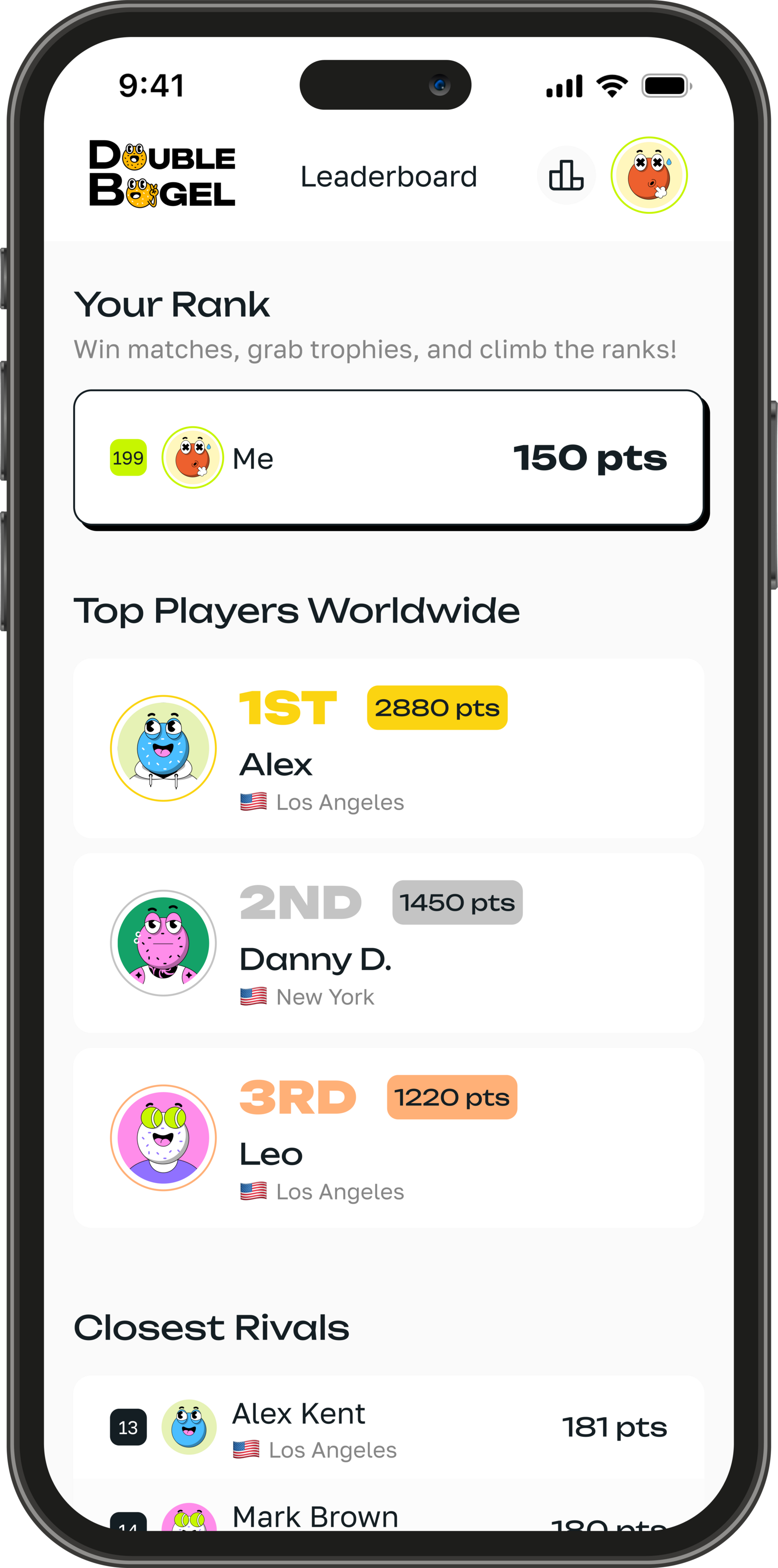
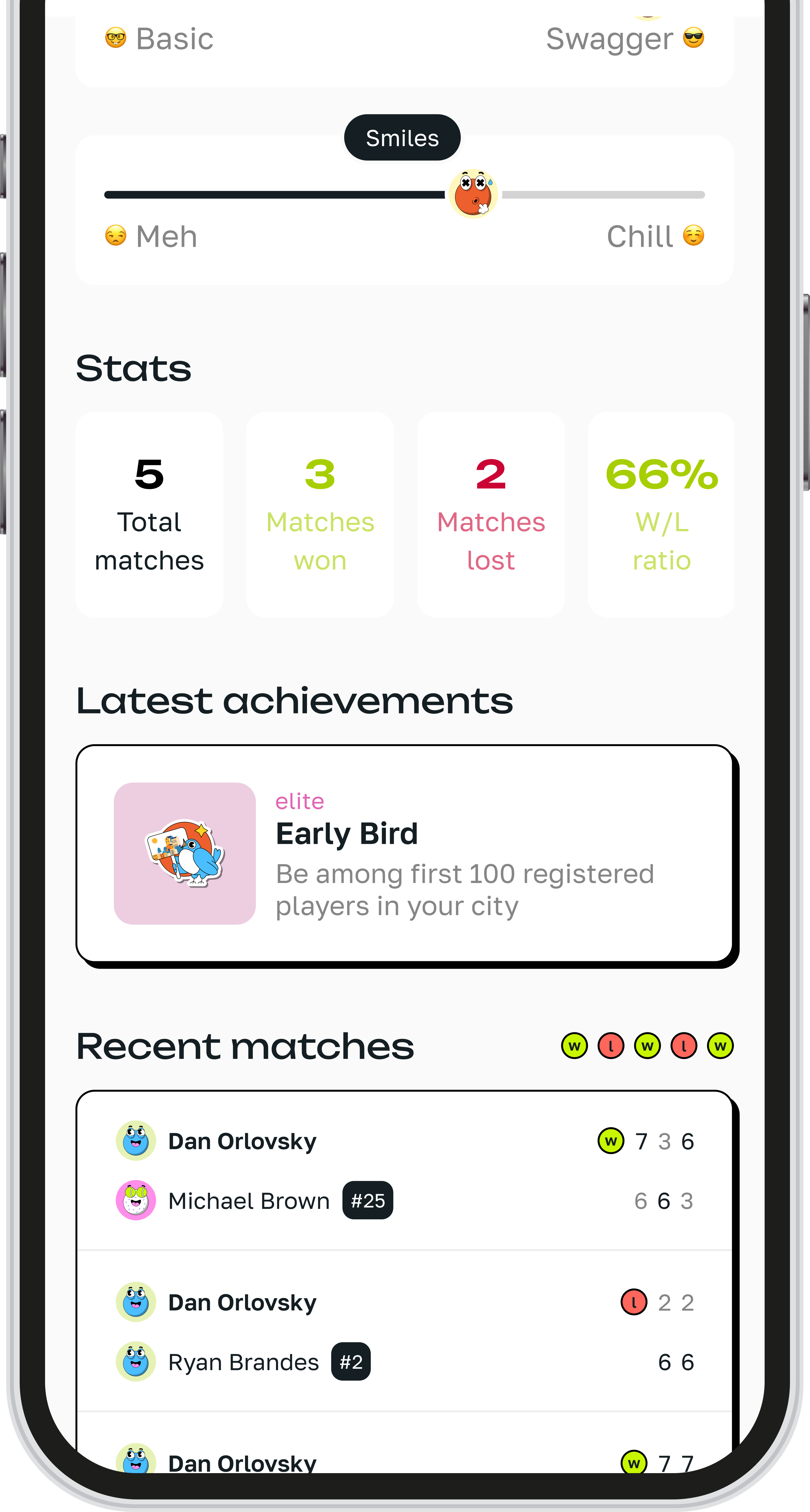
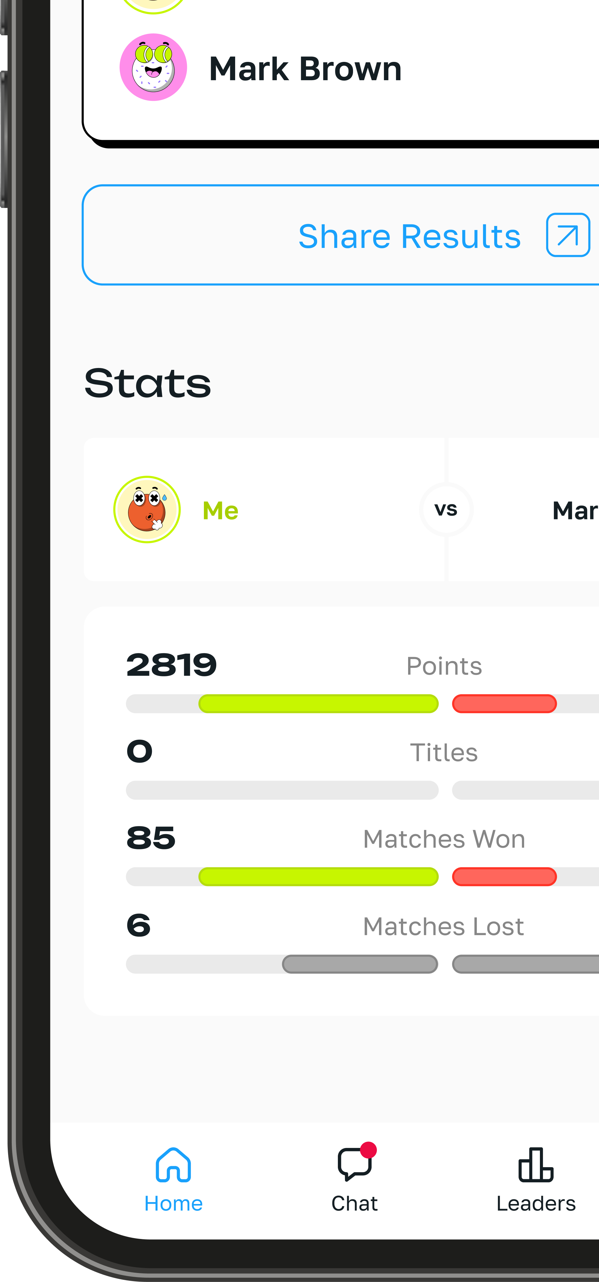
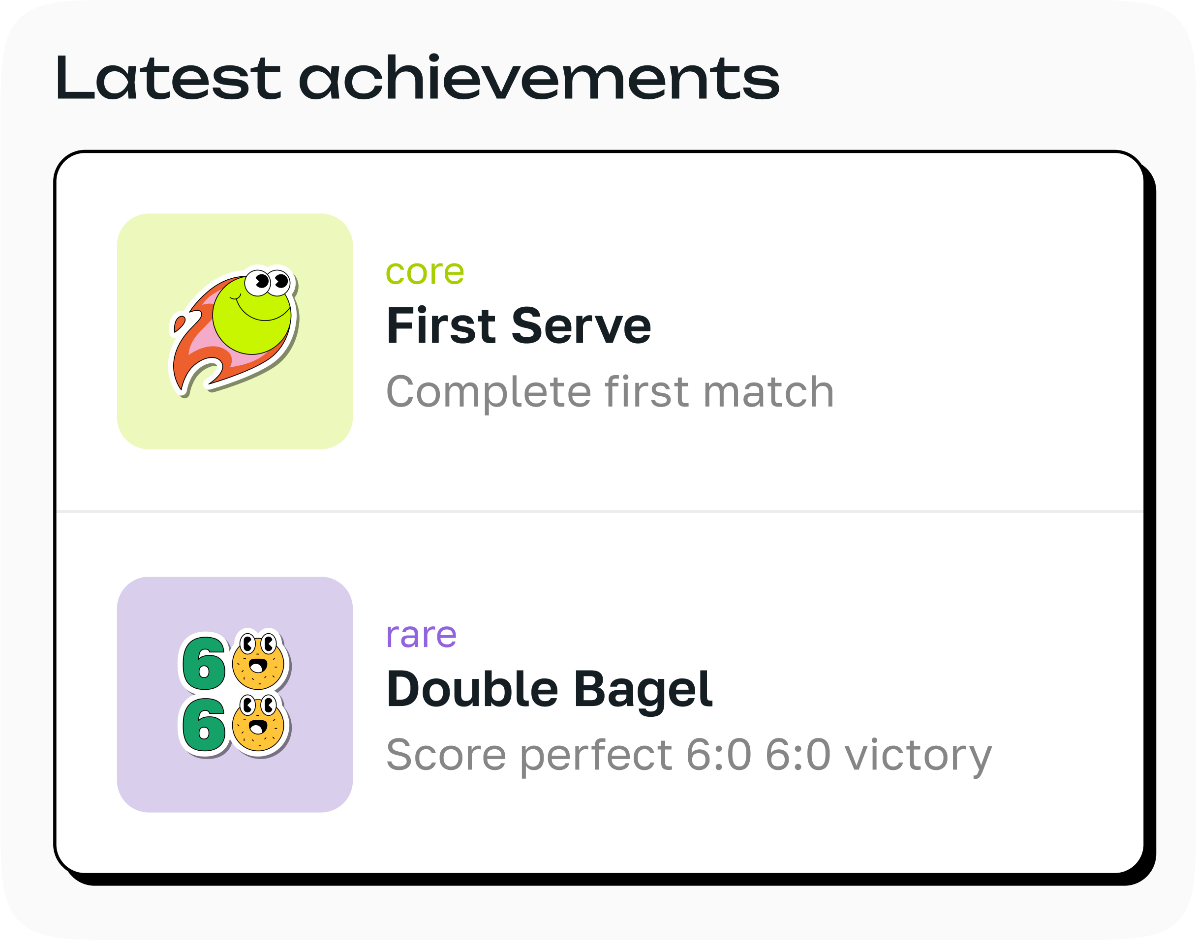
• Motivating UX: gamified with badges, streaks, and visual progress
• Instant access: from app open to match joined in under a minute
• Human touches: encouraging language, celebratory micro-interactions, and ways to build casual community
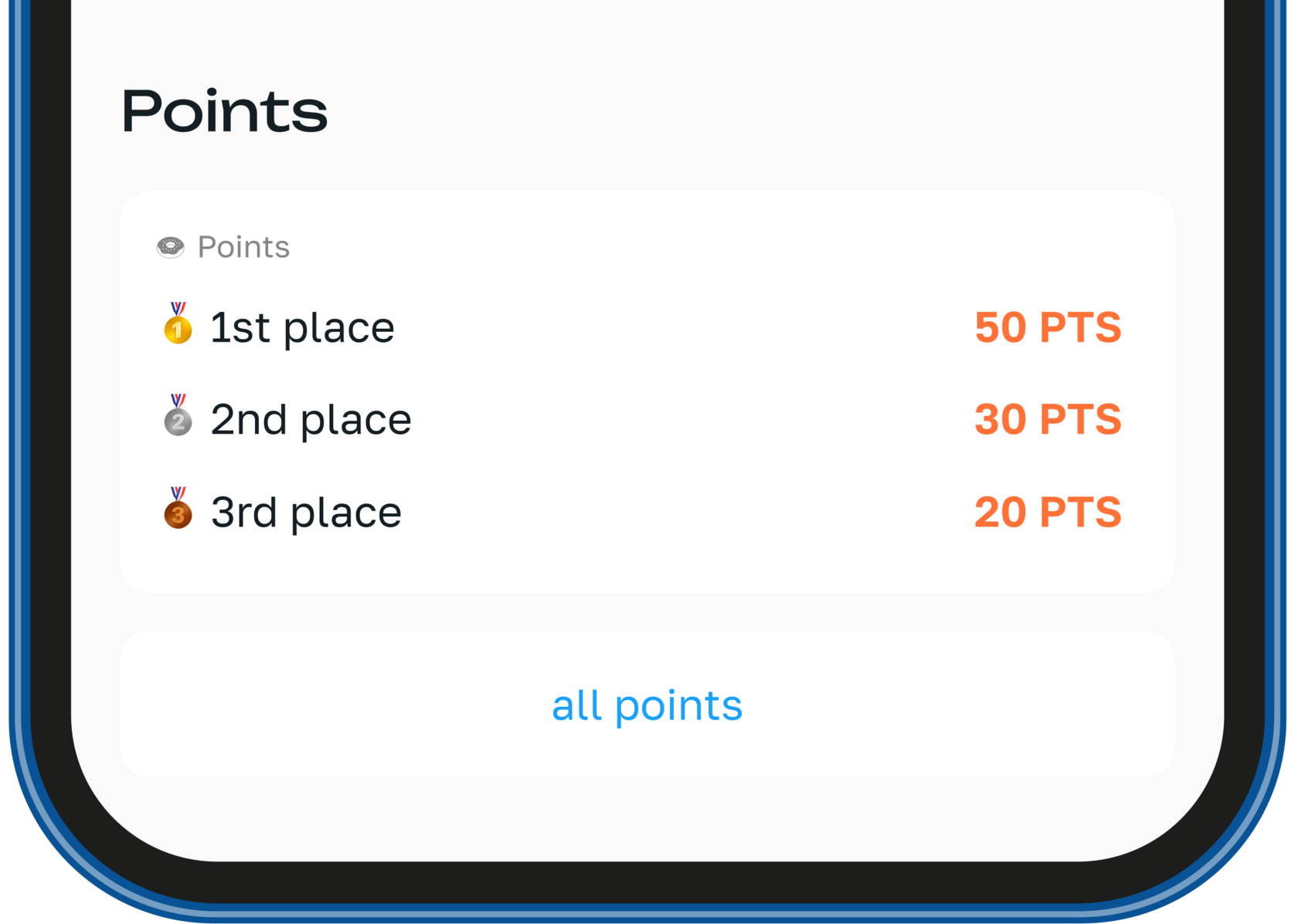
• Motivating UX: gamified with badges, streaks, and visual progress
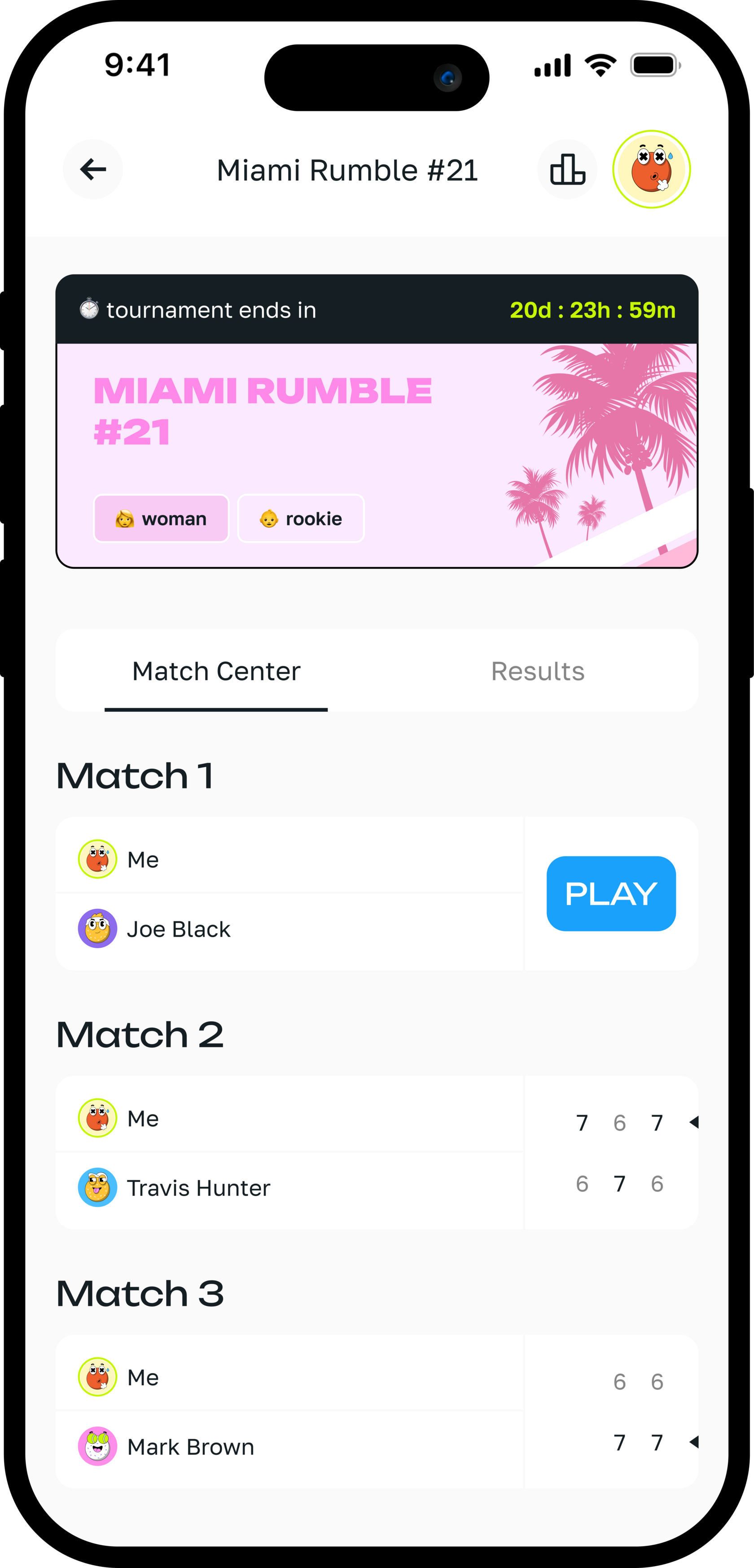
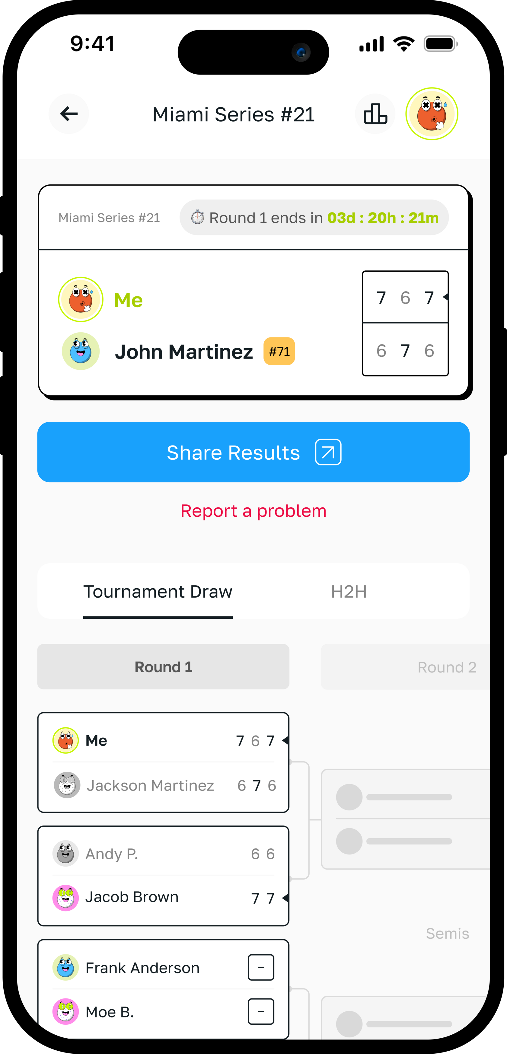
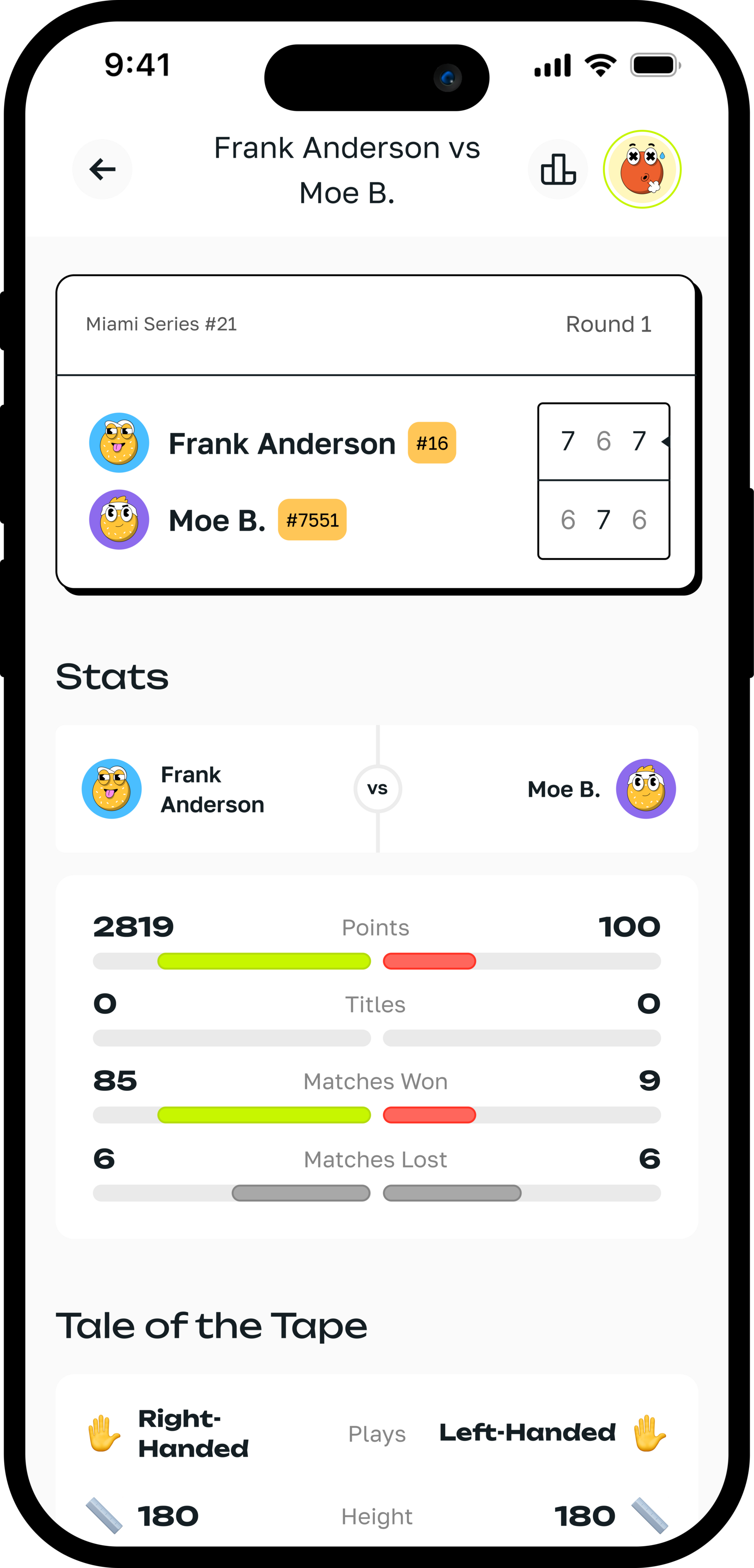
Tournament Flow
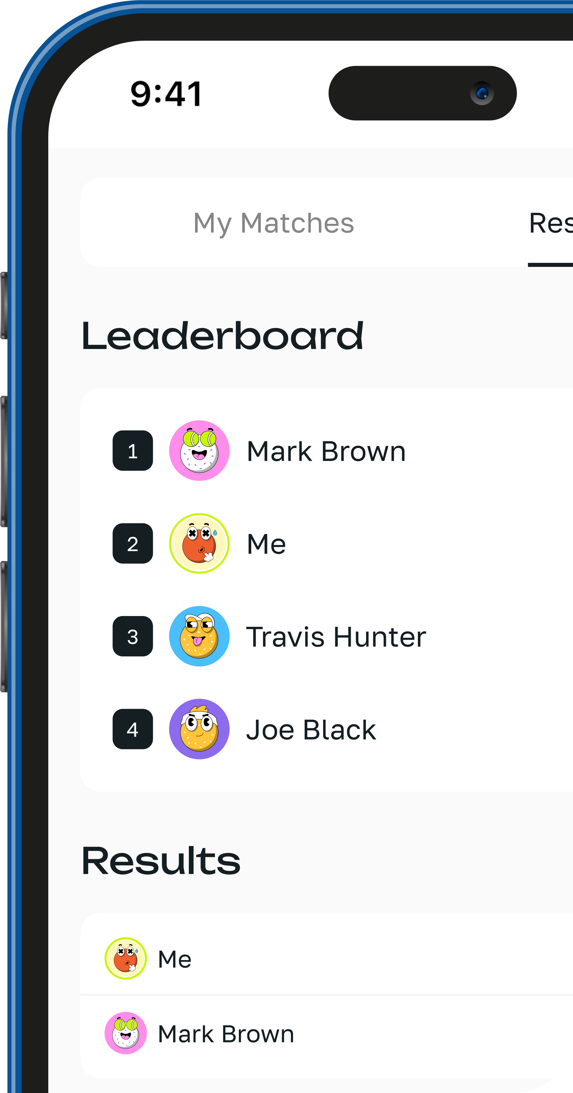
List of Tournaments
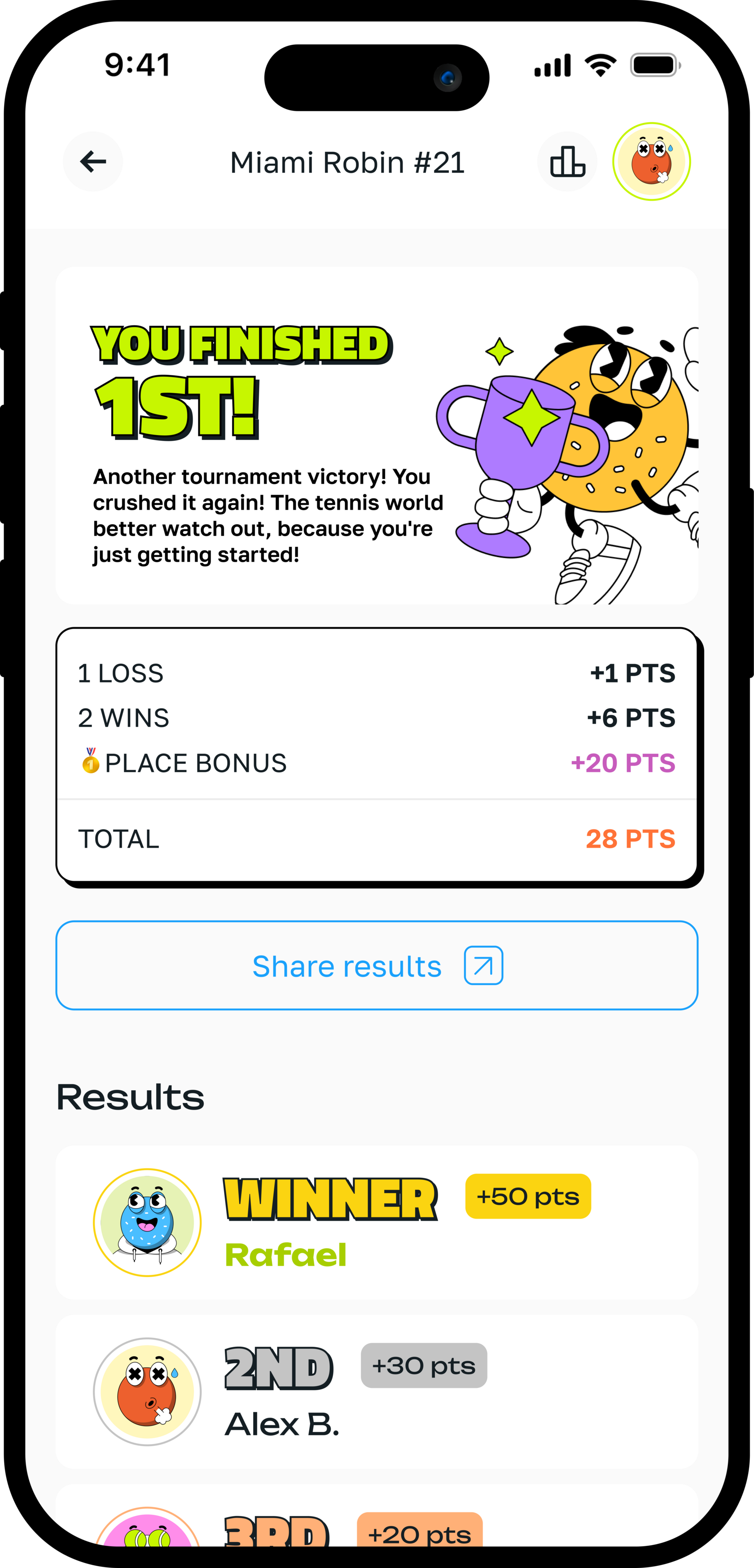
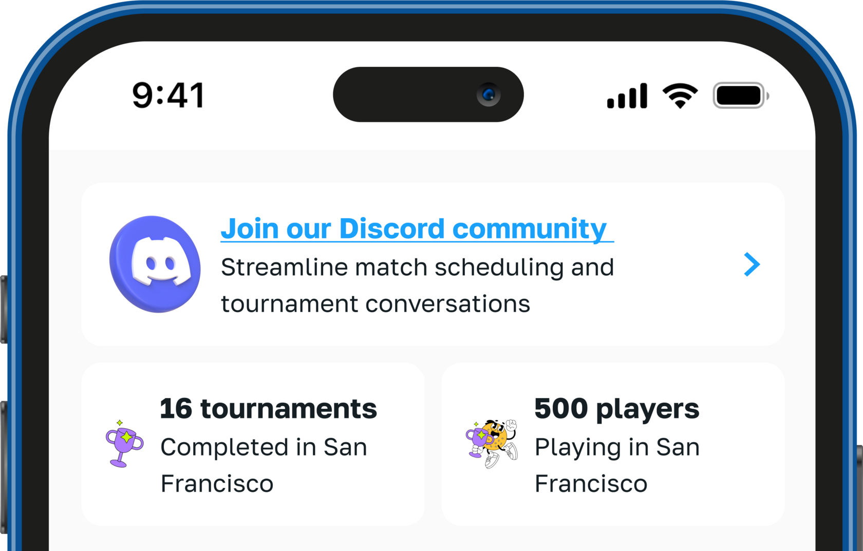
Social features and Gamification
Design
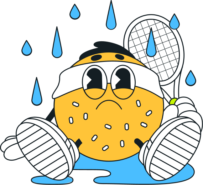
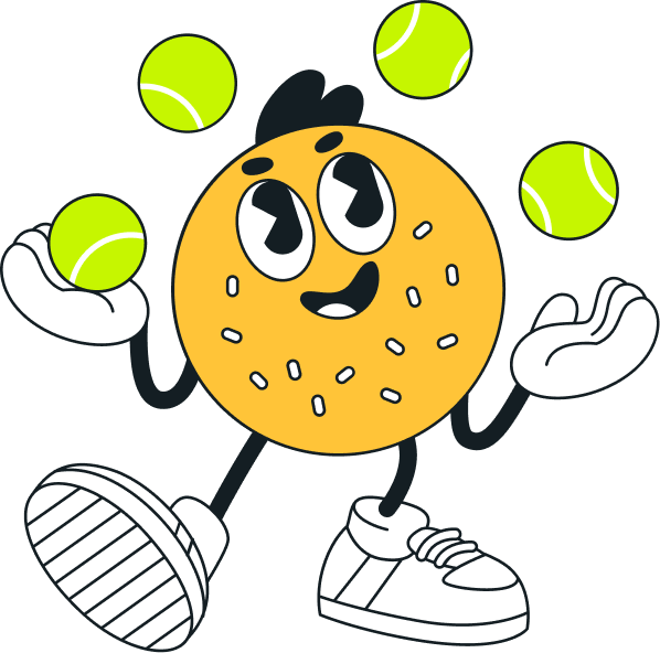
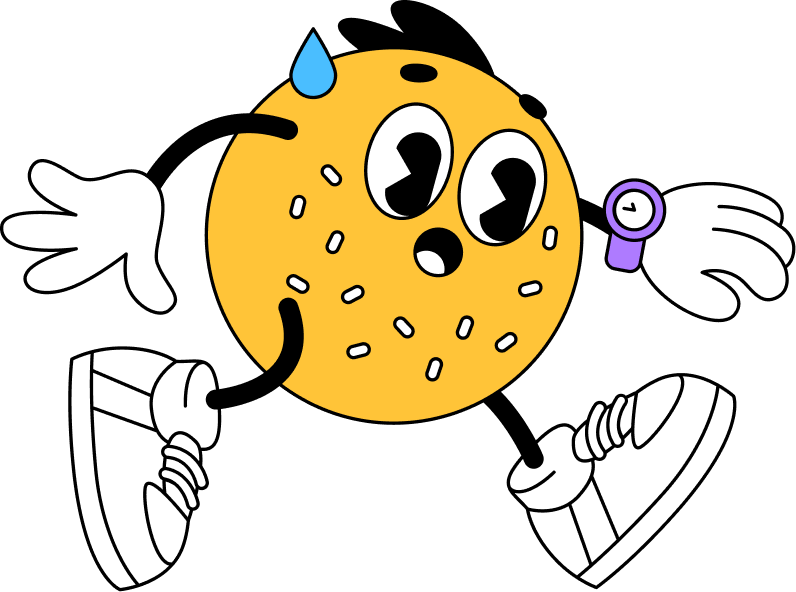
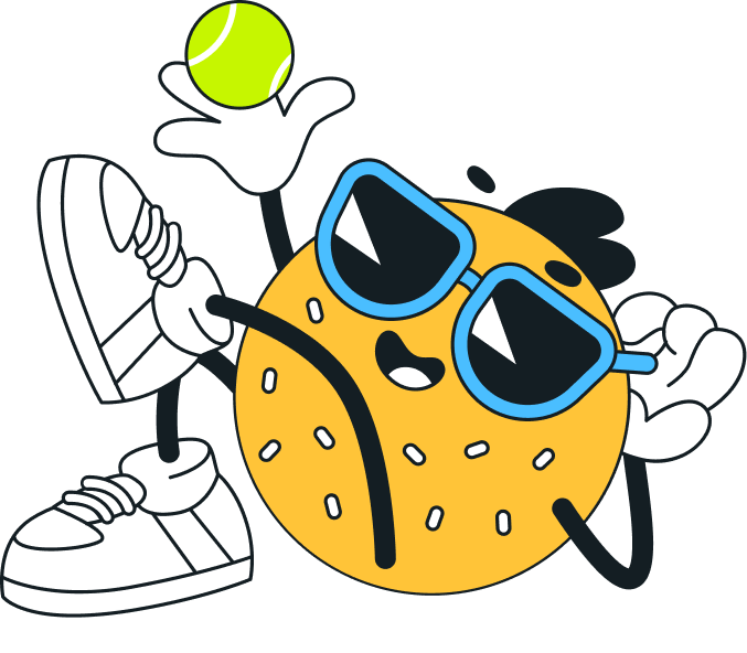
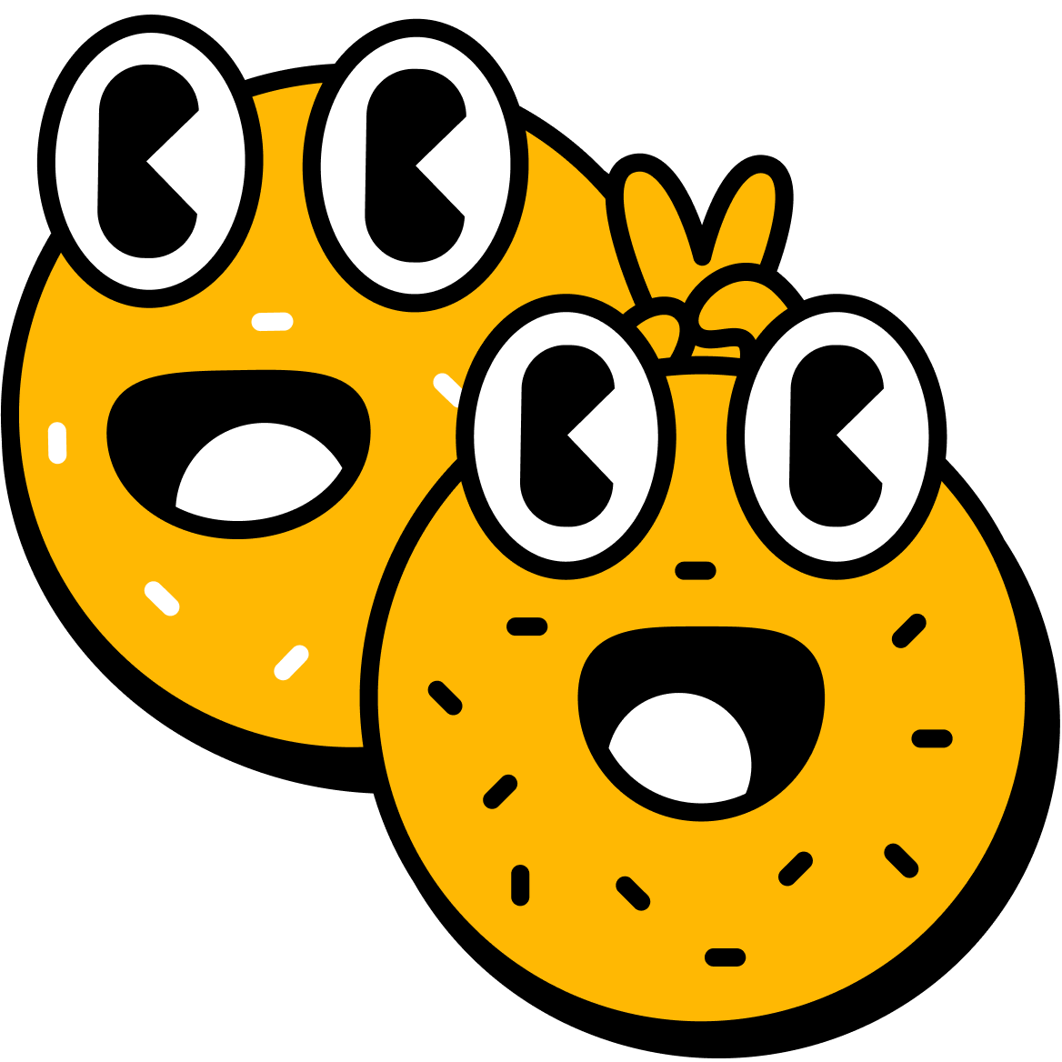
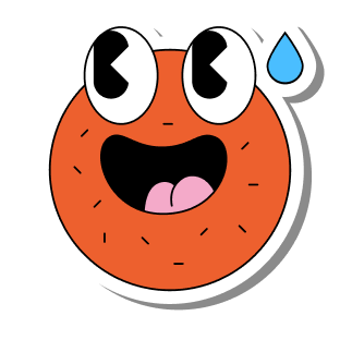
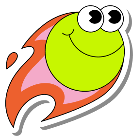
Branding
I also created the full branding and design system, used across the product and marketing materials. The identity leaned into fun and inclusivity, avoiding the hyper-competitive tone often seen in sports apps.

Typography
Headlines
Acid Green
#C6F600
#19A1FC
Active Blue
Primary Dark
#141E23
Body


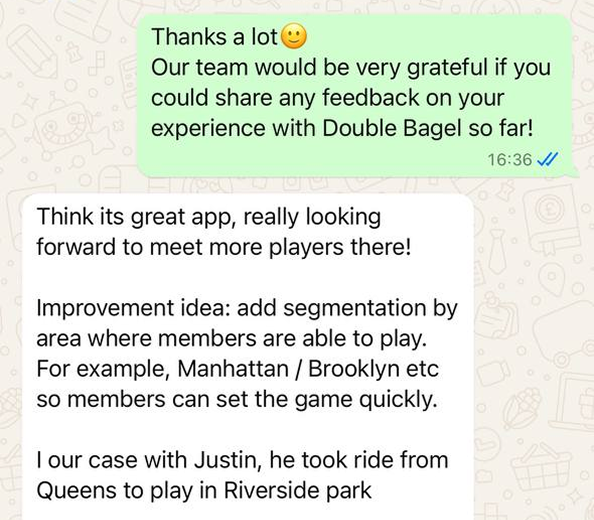
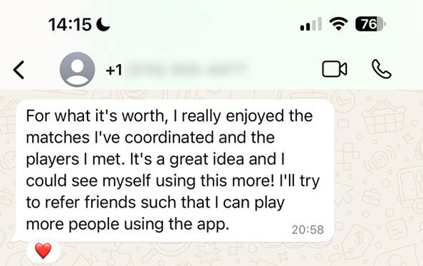
🏅 5,000+ users in the first year with 0 marketing budget
🎖 Rated best UX among tennis apps by early users
❤️ Loved for its quick onboarding and “fun but professional” feel
🎤 50+ user interviews informed product roadmap
🎖 Rated best UX among tennis apps by early users
❤️ Loved for its quick onboarding and “fun but professional” feel
🎤 50+ user interviews informed product roadmap
Results